Charted Territory - The Top 10 Charts Of The Week
Everything from a comparison of historic inflationary episodes to the spending behaviours of Chinese households
I come across hundreds of great charts every week, so I thought it would be interesting to explore this type of chart based format. Please let me know in the comments if you enjoy this type of content, how frequent you think it should be (weekly or fortnightly) or if there is a type of chart you would like included in an upcoming instalment.
U.S Q1 GDP Growth Surprises To The Downside, But….
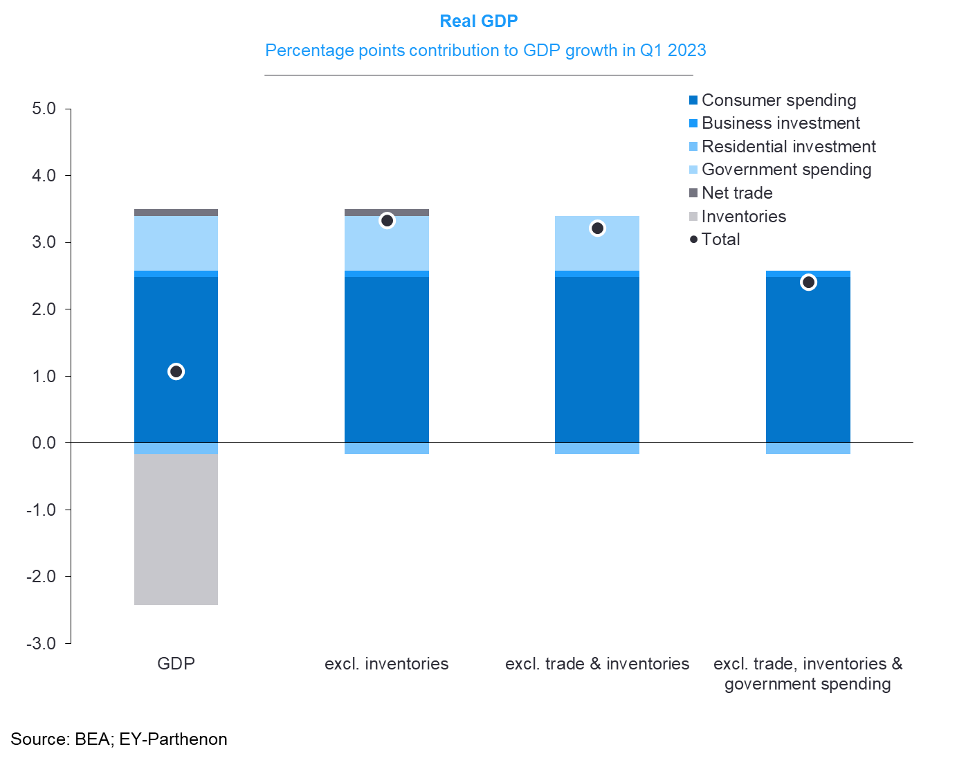
The print came in at just 1.1% QoQ annualized, the weakest result since Q2 2022.
But when you look at the breakdown, the strength of consumer spending for the quarter is quite striking and without the large subtraction provided by inventories it would have been an extremely strong result.
Not much for Jerome Powell and the Fed to hang their hat on here in terms of slowing the U.S consumer economy on this metric.
Chinese Consumers Continue To Save Excessively Relative To Previous Years
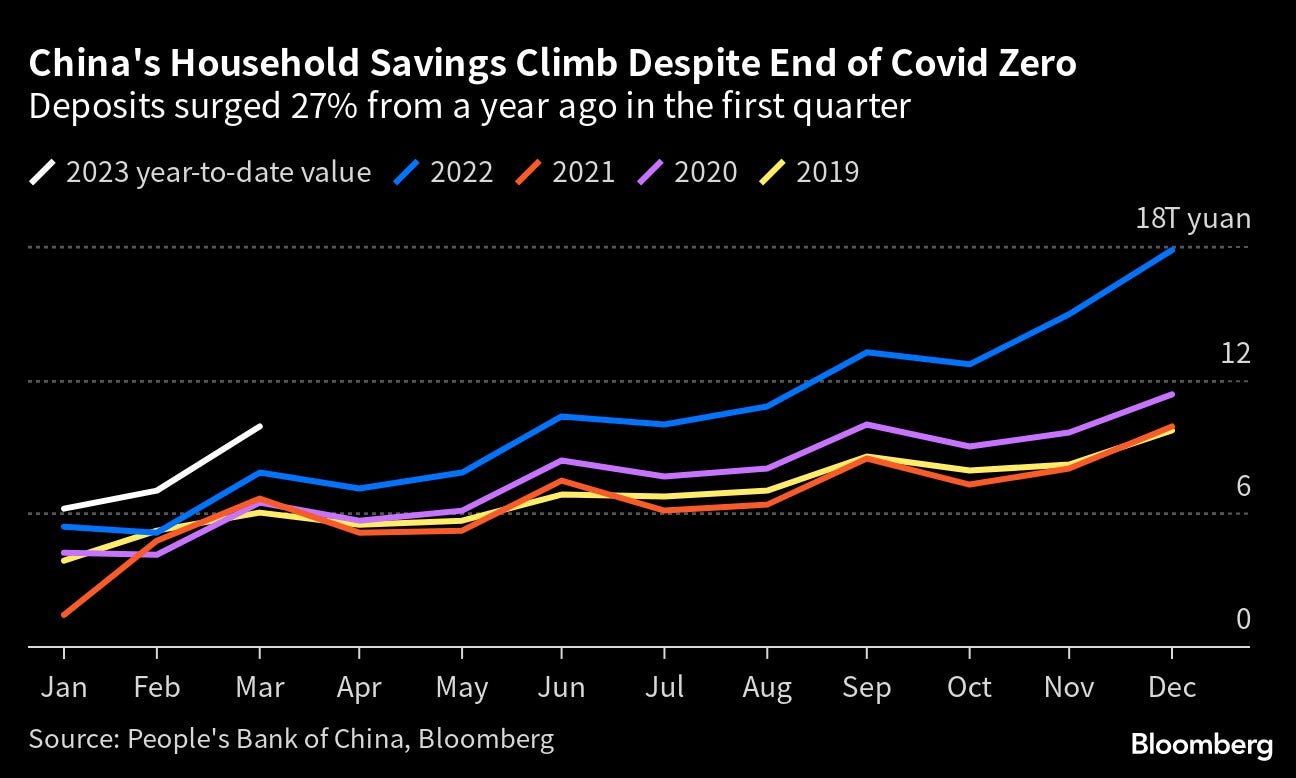
Despite the growing sense of optimism in some quarters over Chinese consumer spending, households continue to save record amounts of cash as uncertainty of China’s economic future continues.
This is something economic data provider China Beige Book (a great Twitter follow) has warned about for quite some time, amidst a far more bullish market consensus.
U.S Core Inflation - Past And Present
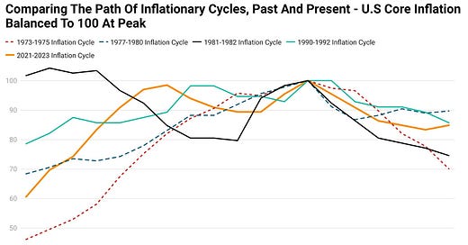
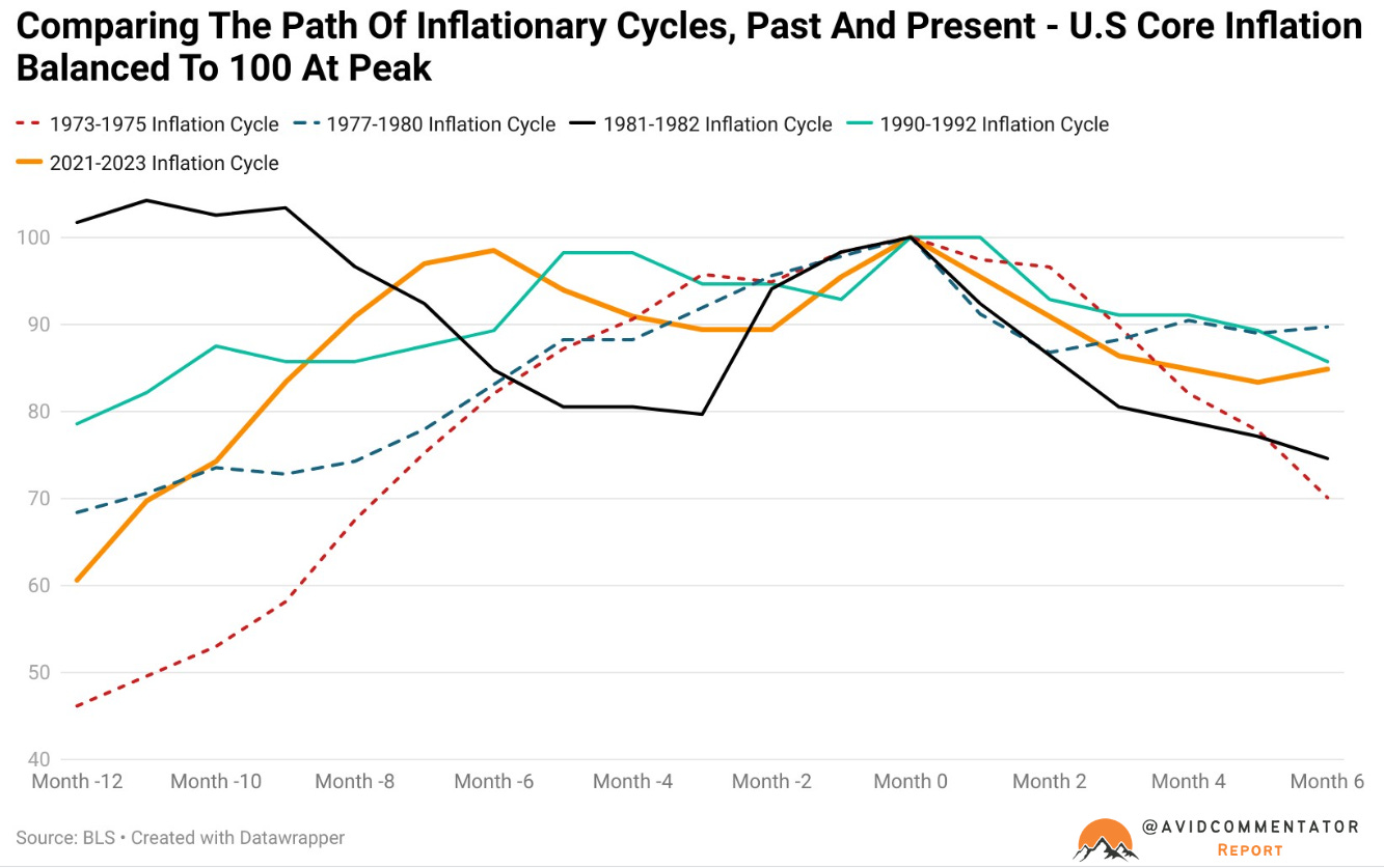
After the release of the latest CPI data I was curious how the current inflation cycle stacked up against those of the past, so I put this together based on the peak of core inflation.
During the last inflation shock from benign levels between 1973 and 1975, core inflation came down from its peak far more swiftly. Whereas during the current cycle inflationary pressures have been far more sticky and long lived.
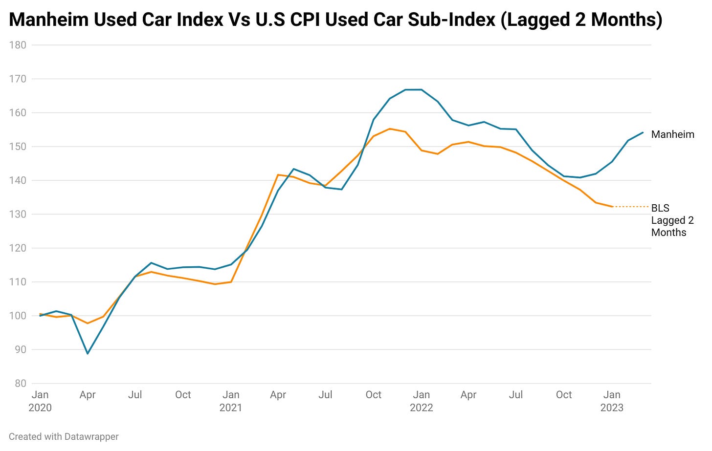
Divergence Between U.S CPI Used Car Component And Manheim Used Car Index
Historically there is a roughly two month lag between outcomes seen in the Manheim Used Car Index and the used car component of the U.S CPI.
However, in recent months that lag has seemingly increased significantly, as Manheim’s index showed flat and then rising prices, while the BLS measure showed continued falls.
If this divergence is resolved by the CPI used car index moving higher to meet the Manheim figure, we could see a strong but potentially brief inflationary impulse over the coming months adding between 0.085 and 0.15% to the month on month core based on the recent moves of the Manheim index.
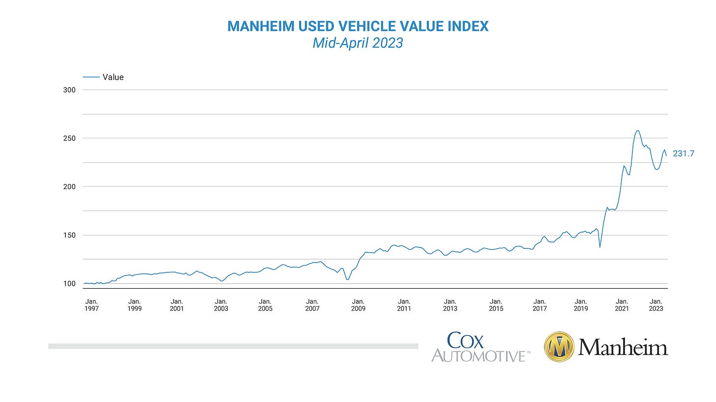
However, according to the most recent data from Manheim which covers up to mid-April, prices have begun falling again as credit to the auto dealership sector dries up amidst the U.S banking sector’s woes.
This is something Twitter account Car Dealership Guy has covered quite extensively (another great follow).
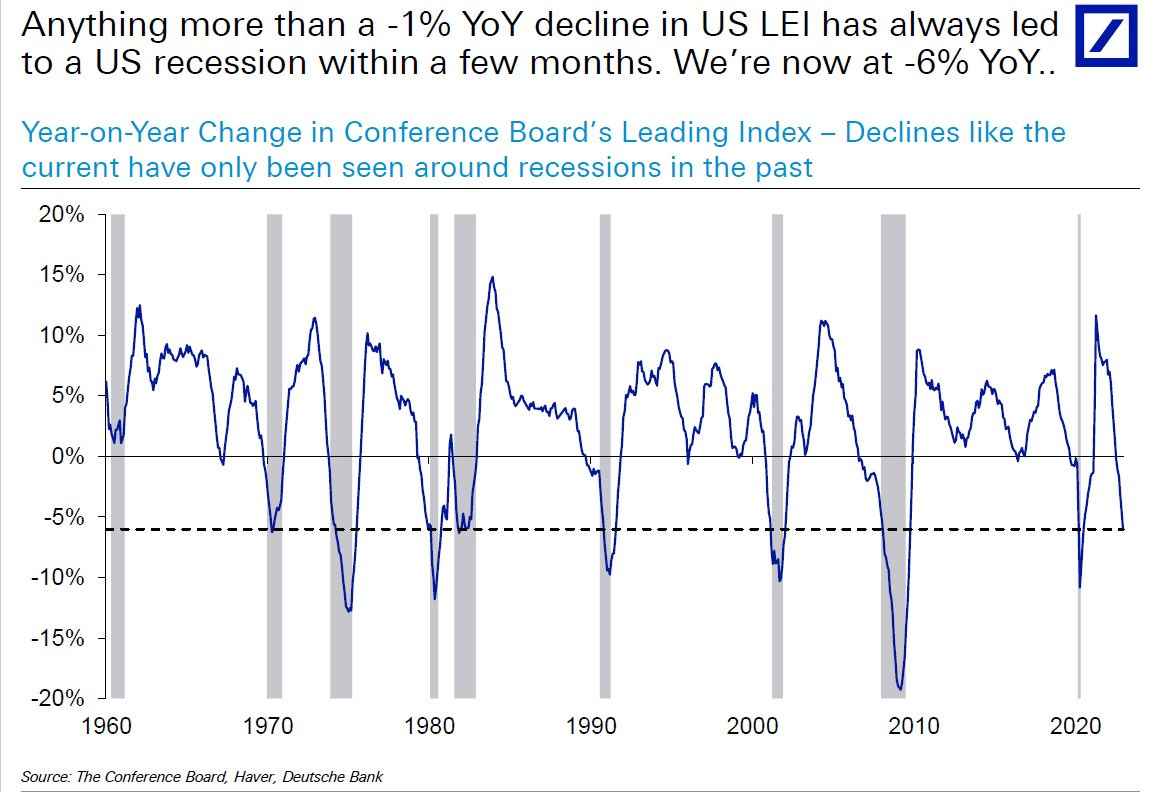
U.S Conference Board Leading Index Points To A Recession
This one pretty much speaks for itself, but its interesting how much longevity this current economic cycle has enjoyed, arguably partially as a result of changed consumer psychology and spending patterns.
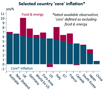
Nations By Core Inflation
Its fascinating how divergent the approach of different central banks can be, particularly when seen through the lens of the underlying level of core inflation.
This chart from IFM’s Alex Joiner illustrates this quite nicely.
The RBA has already paused in raising rates and lags the rest of the pack significantly, yet also has the highest rate of core inflation out of the assessed countries.
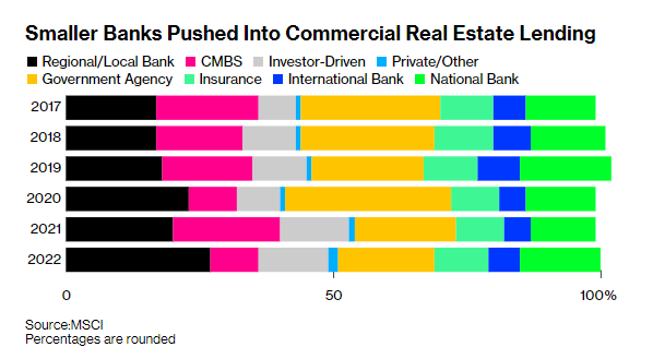
Smaller U.S Banks Ramped Up Exposure To Commercial Real Estate During The Pandemic
Commercial real estate and Commercial Mortgage Backed Securities (CMBS) were always going to be an issue eventually, as lower valuations due to working from home and changed consumer consumption patterns fed into prices.
With the recent issues and deposit outflows experienced by small and regional U.S banks, the commercial real estate issue has taken on a challenging new dimension.
While its likely quite some time before the issue really starts to bite, its a factor worth keeping an eye on as the impact of tightening monetary policy continues to unfold.
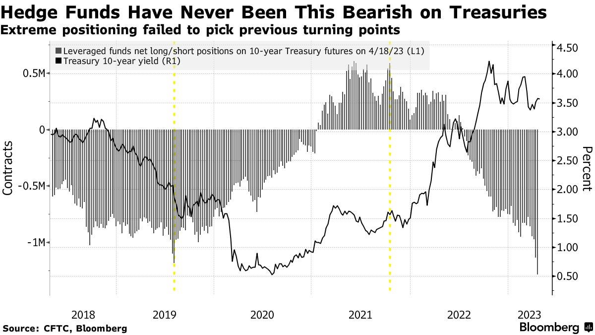
High Level Of Shorts On The 10 Year
With shorts on the U.S 10 year highly elevated, the U.S bond market remains prone to swings in volatility in technical terms. Throw in the ongoing woes of the U.S banking sector and things are likely to remain shall we say interesting, in the U.S bond market for the foreseeable future.
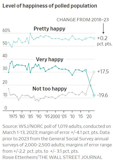
American Happiness Levels Deteriorate
I thought this would be an interesting chart to end on, because ultimately these sorts of perceptions can influence everything from choices at the ballot box all the way through to economic policy.
— If you would like to help support my work by donating that would be much appreciated, you can do so via Paypal here or via Buy me a coffee. Regardless, thank you for your readership.
If you would like to support my work on an ongoing basis, you can do so here via Patreon or via Paypal here





Weekly would be great Tarric
I like the use of and short explanation of visualizations to get points across whilst removing the challenges of filtering these on fintwit myself as I’m learning
CRE comments missing the elephant in the room: Duration Risk.